
How To Mix Prints Without It Looking Like Chaos
“Mixing prints is really just about confidence. Trust your eye. If it makes you smile when you walk into the room, it works.“
There’s a fine line between an effortlessly curated gallery wall and the visual equivalent of static. Mixing prints sounds easy in theory until you’re halfway through hanging them and suddenly questioning every life decision that led you to own six pieces with completely different colours, vibes, and sizes.
The truth is, nobody really knows the rules for mixing art. You just see other people’s homes online and wonder how on earth they made clashing styles look intentional instead of like a Facebook Marketplace haul. I’ve been there. I’ve had that moment where you hold up a print, think this might work, then immediately put it down again because now it doesn’t.
But here’s the thing, chaos can be controlled. You just have to decide what kind of chaos you’re going for.
1. Start with one print that sets the mood
Pick your anchor piece, the one that decides the rest. Maybe it’s bold and abstract, or maybe it’s soft and minimal. Either way, this print is the main character. Everything else just needs to play nicely around it.
2. Keep a loose colour story
You don’t need to be matchy matchy. In fact, please don’t be. Instead, pick two or three colours that show up across different prints, even subtly. It tricks the eye into thinking everything belongs together. Think of it like dressing your walls, not a uniform, just coordination.
I love mixing bold primary tones in my own work, rich reds, punchy blues, deep greens, and warm yellows. Especially reds. They bring warmth and confidence into a space without needing everything else to match. Great for lovers of strong colour and unapologetic walls.
3. Mix textures, not just designs
Flat paper prints can still have depth. Pair something graphic with something painterly, or something photographic with something typographic. The contrast keeps it interesting, especially if your walls are neutral. And if they’re magnolia, you’re already halfway there. Bold colour looks incredible on a plain wall.
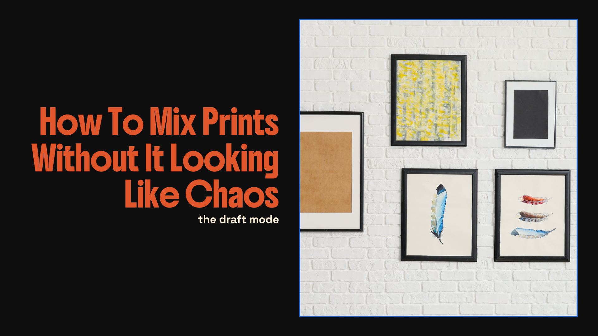
4. Be mindful with frames
Frames can make or break the look. Sometimes adding a mix of art styles and frame types together can be too much, especially if the colours and materials start to compete. If your prints already have a lot going on, keep your frames simple and uniform to give the wall some breathing space.
Or you can go the opposite way and mix the frames too. Pair different woods, metals, and colours to make the chaos look more intentional. The key is to commit. When it looks like a decision instead of an accident, it always works.
5. Play with scale
Big and small together always looks better than everything being the same size. Cluster small pieces close, let the larger ones breathe. You want it to look like a conversation, not an argument.
6. Don’t overthink alignment
Real homes aren’t showrooms. Frames don’t need to line up perfectly to look good. If one’s a bit off, it just proves a human lives there. Imperfection makes it better, I promise.
7. Let your art clash a little
A little tension keeps things alive. A bright abstract next to a moody quote print works because they balance each other. Think less they must match and more they must have a personality.
Mixing prints is really just about confidence. Trust your eye. If it makes you smile when you walk into the room, it works. The secret is that nobody else actually knows what they’re doing either, they just commit to it.
So mix, match, hang, rearrange, and lean things against the wall until it feels right. The beauty of prints is that nothing’s permanent. You can always move them, swap them, or start again.
If you’re ready to build your own not at all chaotic wall, you can find my art print collection here filled with colour, personality, and pieces that actually get along.