
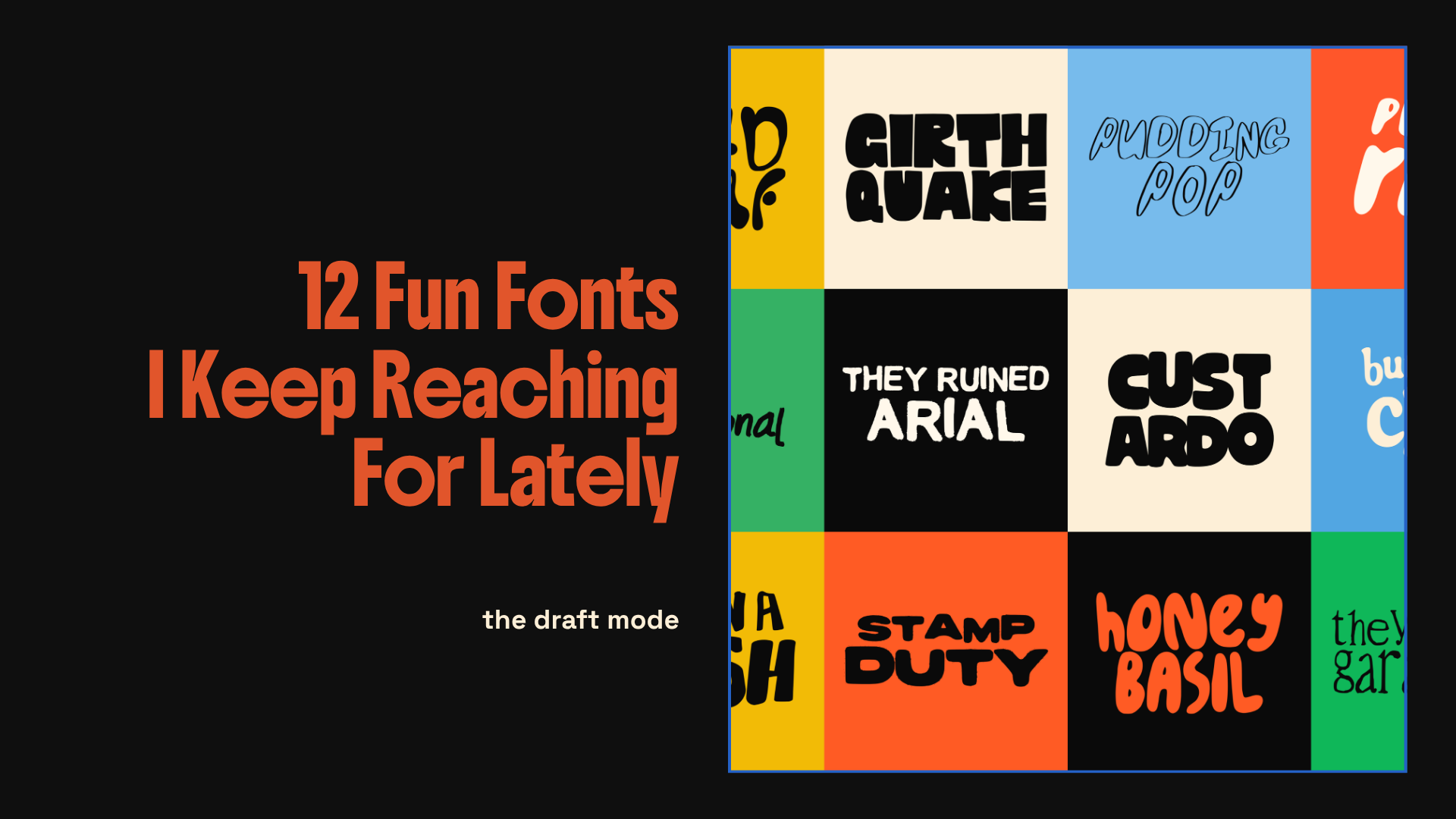
12 Fun Fonts I Keep Reaching For Lately
“Typography is usually the thing that gives a design its voice.
Some fonts feel loud. Some feel nostalgic…“
There’s a very specific type of font I always end up loving. The slightly weird ones. The fonts that feel a bit imperfect, a bit hand touched, a bit too chunky or uneven to ever be called “clean corporate minimal”. The kind that instantly make a design feel more alive before you’ve even added colour, texture, or imagery.
A while ago I started making my own fonts because I couldn’t really find the exact styles I wanted to use in my work. Everything either felt too clean, too corporate, too polished, or just overly familiar. I wanted typography that felt more playful, expressive, awkward, chunky, textured, messy, or slightly chaotic in a way that still felt intentional.
So I started making them myself and honestly, font design ended up becoming one of my favourite parts of the creative process.
There’s something really fun about building a typeface from scratch. Tweaking curves. Making letters intentionally uneven. Deciding how exaggerated something should feel. Letting certain characters look a bit strange or imperfect because that’s exactly what gives them personality in the first place.
I think a lot of design online has started blending together recently. Same layouts. Same polished sans serif fonts. Same stripped back aesthetic. And while there’s nothing wrong with that, it does mean work can start feeling a bit interchangeable after a while. Typography is usually the thing that gives a design its voice.
Some fonts feel loud. Some feel nostalgic. Some feel soft. Some feel expensive. Some feel like they’ve been dragged through a sketchbook at 2am. Those details completely change the energy of a piece before you’ve even added imagery or colour.
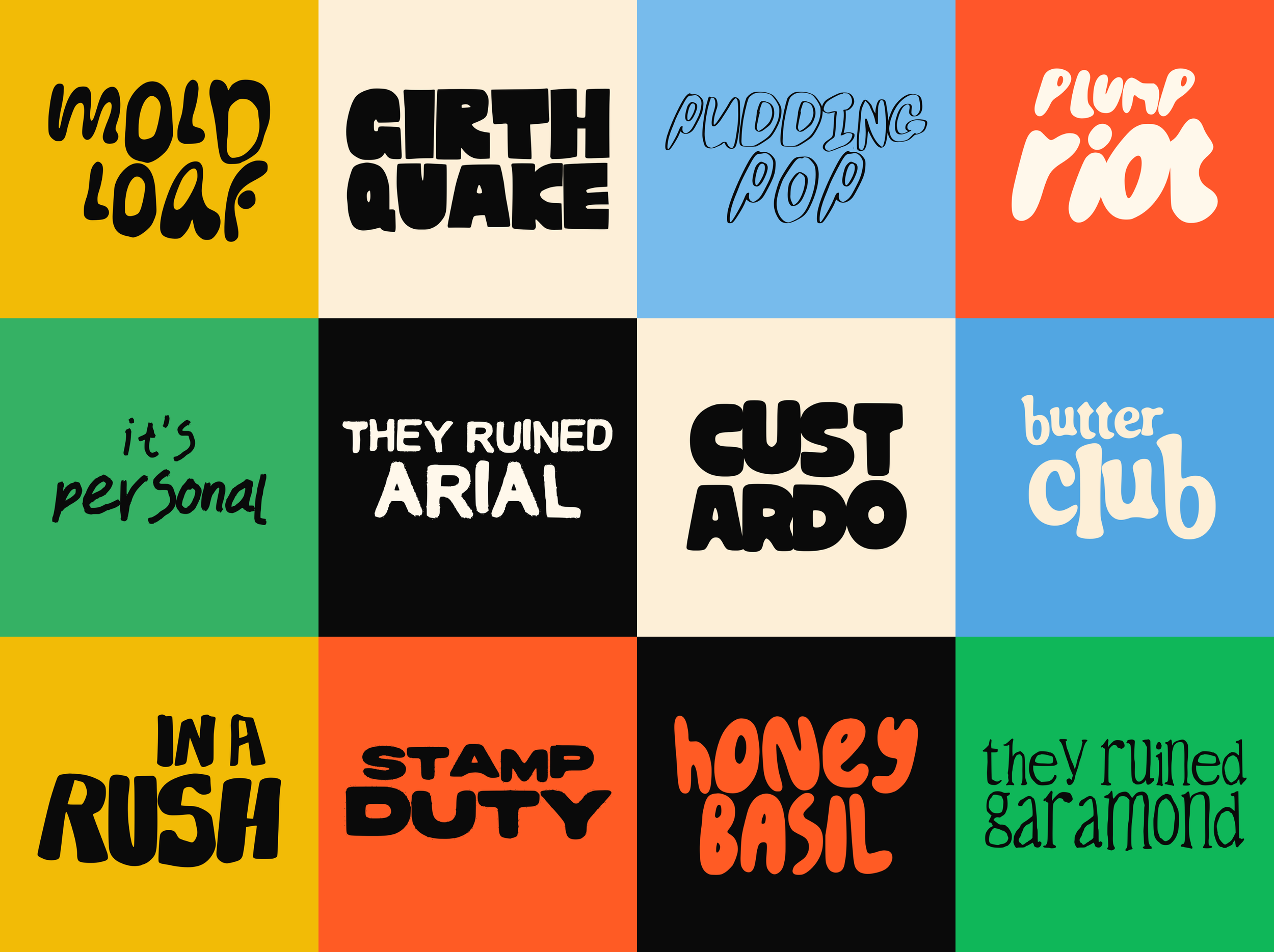
So here is my favourite 12 so far! Scroll to the bottom to see a preview of all of these together….
Mold Loaf
Mold Loaf feels slightly melted in the best way possible. Soft, uneven, chunky letterforms that almost look like they’ve been stretched by hand. I love using this one when something needs to feel playful without looking too polished or overly cute.
Girth Quake
This one is loud. Heavy, compact, oversized shapes that instantly take over a layout. Girth Quake was designed for big statements, chaotic headlines, and typography that refuses to sit quietly in the background.
Pudding Pop
Pudding Pop is way more loose and scribbly compared to some of the heavier fonts in the collection. It has this sketchbook quality to it that feels quick, expressive, and a little bit messy in a really fun way.
Plump Riot
Probably one of the most inflated fonts I’ve made. Everything about it feels soft, bubbly, oversized, and dramatic. It works really well for playful branding, posters, packaging, and anything that needs a slightly ridiculous amount of personality.
It’s Personal
This one feels much more handwritten and emotional. Loose, imperfect strokes that feel a bit more intimate and human compared to the chunkier display fonts. I like using this one when something needs to feel more casual or personal rather than overly designed.
They Ruined Arial
Part joke. Part genuine frustration. I wanted this one to feel bold, awkward, over exaggerated, and slightly wrong in a way that somehow still works. It’s very graphic design brain humour mixed with chunky distorted typography.
Custardo
Custardo has a much more retro heavy display feel to it. Thick compressed shapes with slightly strange proportions that make it feel nostalgic but still modern enough to work in contemporary branding and poster layouts.
Butterclub
Butter Club is probably one of the softest fonts in the bundle. Rounded curves, playful shapes, and a more friendly energy overall. It feels very 70s inspired without going fully vintage costume party.
In A Rush
Tall, condensed, and slightly frantic looking. I wanted this one to feel energetic and immediate, like something quickly stamped onto a poster before running out the door.
Stamp Duty
This one leans more graphic and punchy. Thick, compressed shapes with a slightly rugged edge that work really well in bold layouts, branding, merch, and editorial headlines.
Honey Basil
Honey Basil feels warm, squishy, and slightly chaotic. The exaggerated curves and uneven shapes make it feel really alive on a page. Definitely one of my favourites for playful packaging and louder poster designs.
They Ruined Garamond
This started with the idea of taking something traditionally elegant and making it feel slightly strange and uncomfortable. It still has those serif influences underneath, but everything feels warped, stretched, and a little bit haunted.
The only font bundle you will ever need! Download it here.
Over time I realised I kept reaching for the same type styles across posters, branding projects, social graphics, packaging, mockups, and print work. So I ended up pulling together 12 of my most used and most popular fonts into one bundle because they all naturally sit within that same quirky, expressive world.
If you’re into typography with a bit more personality, you can find the bundle over here!