How to Choose Fonts for Branding: 10 Creative Font Styles for Different Brand Personalities
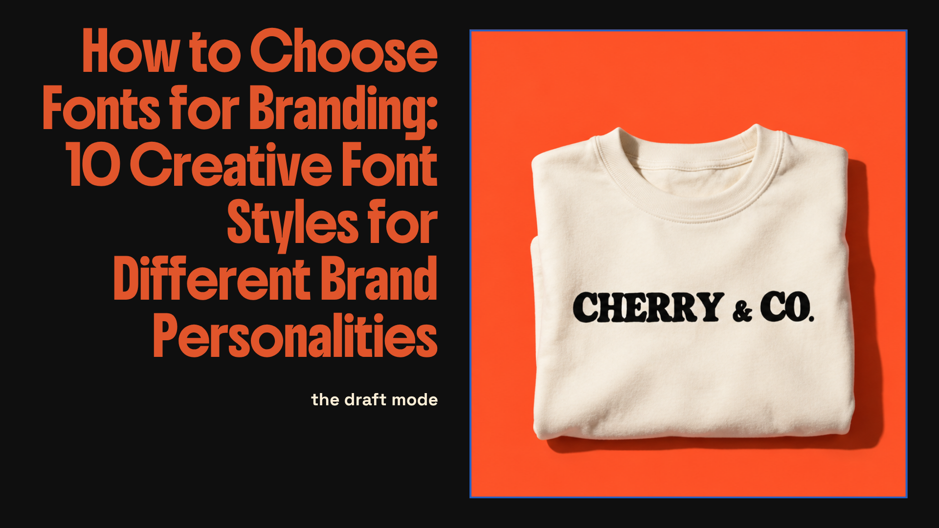
“If you’re working on branding, packaging, posters or anything remotely visual, it helps to think less about finding “the best font” and more about finding the right type of personality.“
Choosing a font for a brand sounds easy until you’re 45 minutes deep into a font folder, everything suddenly looks the same, and you’ve convinced yourself that maybe Helvetica is personality.
It isn’t.
The right font can completely change how a brand feels before you’ve even touched colour, imagery or layout. It can make something feel playful, expensive, chaotic, nostalgic, handmade, loud, soft, weird or like it has absolutely no interest in behaving properly.
If you’re working on branding, packaging, posters or anything remotely visual, it helps to think less about finding “the best font” and more about finding the right type of personality.
Here are 10 creative font directions I’d look at for different kinds of brands.
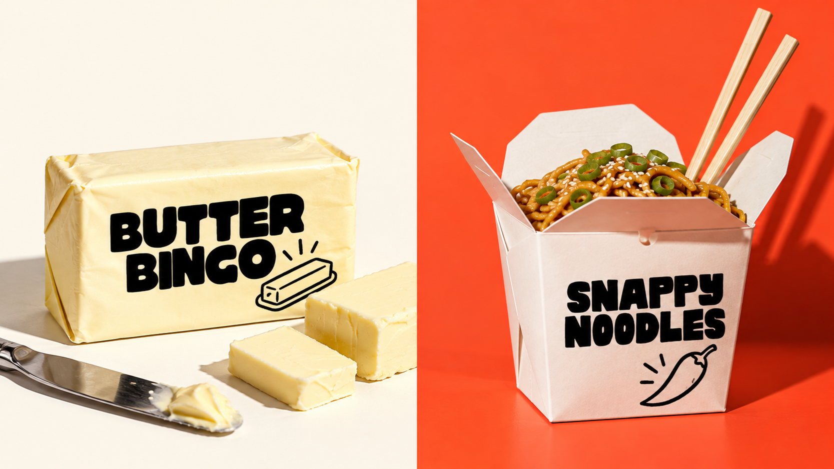
1. Chunky playful fonts
Best for: food brands, kids brands, playful packaging, social-first businesses
Chunky fonts are great when you want something friendly, bold and immediately noticeable.
They work especially well when the brand needs to feel approachable rather than polished to death. Think snack packaging, cafés, ice cream brands, sticker packs and anything that would happily use a smiley face without overthinking it.
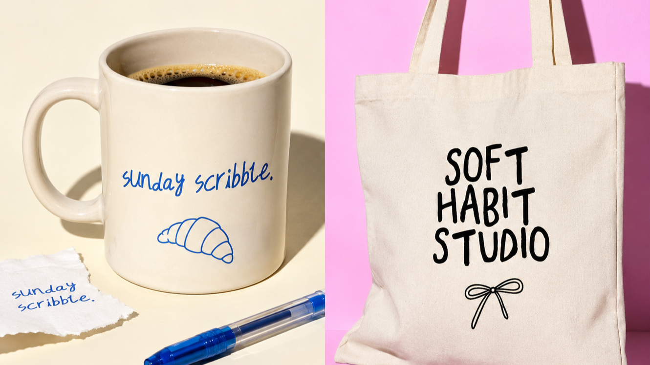
2. Loose handwritten fonts
Best for: lifestyle brands, creative businesses, handmade products, personal branding
Handwritten fonts can make a brand feel much more human.
The trick is avoiding ones that look too perfect. If it looks like someone spent six hours carefully pretending to write casually, the whole thing starts feeling a bit suspicious.
I tend to prefer handwritten fonts with uneven shapes, strange little joins, wonky baselines and a bit of actual personality.
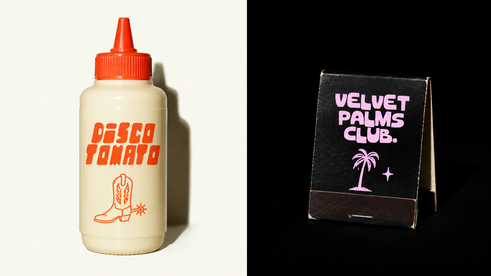
3. Retro display fonts
Best for: fashion, music, bars, food, vintage-inspired brands
Retro display fonts are useful when you want a brand to feel instantly referential without rebuilding an entire 1970s supermarket aisle.
They can bring warmth, nostalgia and character very quickly, especially when paired with simpler supporting type.
They’re also really good for logo marks where you want the typography itself to do most of the visual work.
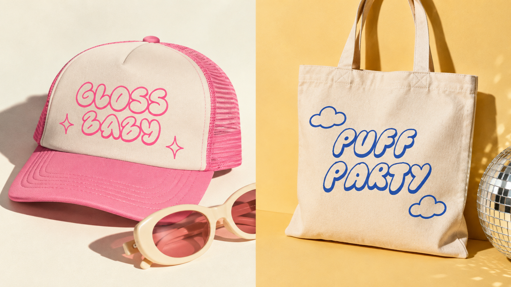
4. Bubble fonts
Best for: beauty, fashion, music, playful campaigns
Bubble fonts are great when you want something soft, weird, glossy or slightly ridiculous in a good way.
They tend to work best when they’re given room to breathe and aren’t forced into long paragraphs where they immediately become someone else’s problem.
Use them for headlines, packaging fronts, logos, merch and short phrases.
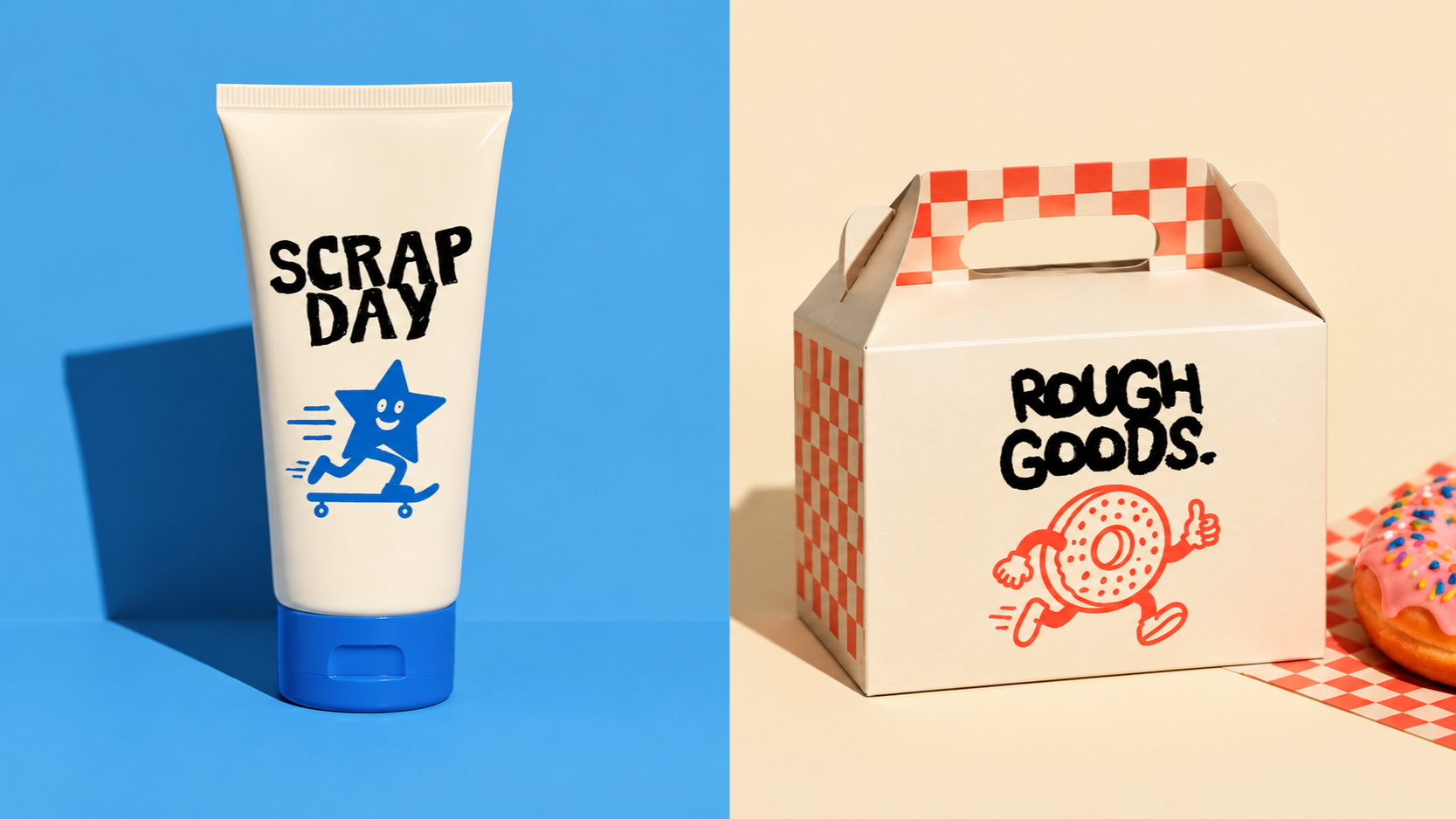
5. Rough hand-drawn fonts
Best for: artists, independent brands, posters, music, handmade products
A rough hand-drawn font can instantly make a brand feel less corporate.
You get texture, irregularity and little imperfections that make the type feel made rather than generated.
These are especially useful if the rest of the branding is quite clean because they create contrast without needing to add loads of extra visual clutter.
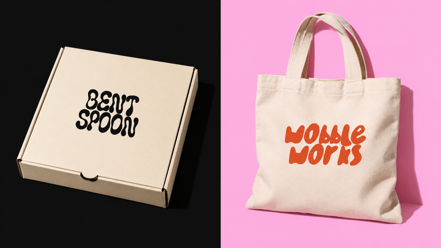
6. Wonky fonts
Best for: creative studios, indie brands, food, fashion, experimental projects
Wonky fonts are one of my favourite ways to make a brand feel less generic.
Slightly uneven widths, strange shapes and off-kilter baselines can make something feel instantly more bespoke.
Perfect for brands that want to look creative but don’t want to rely on the same polished minimal look everyone else is using.
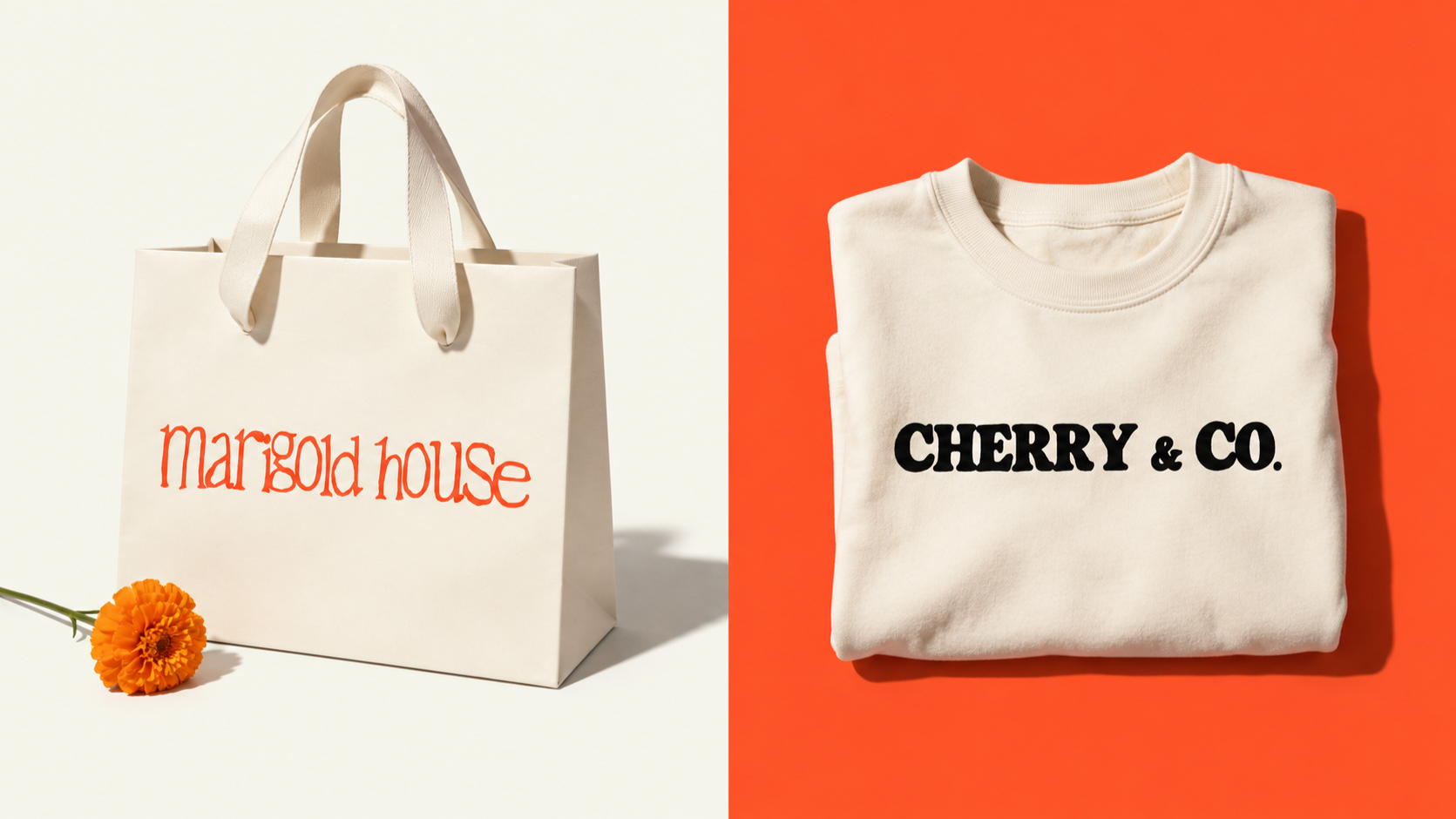
7. Quirky serif fonts
Best for: fashion, editorial, restaurants, beauty, creative brands
A serif does not have to mean serious.
There are loads of strange, chunky and exaggerated serif styles that feel much more expressive than traditional editorial typography.
These work really well if you want something that feels stylish but still has a sense of humour.
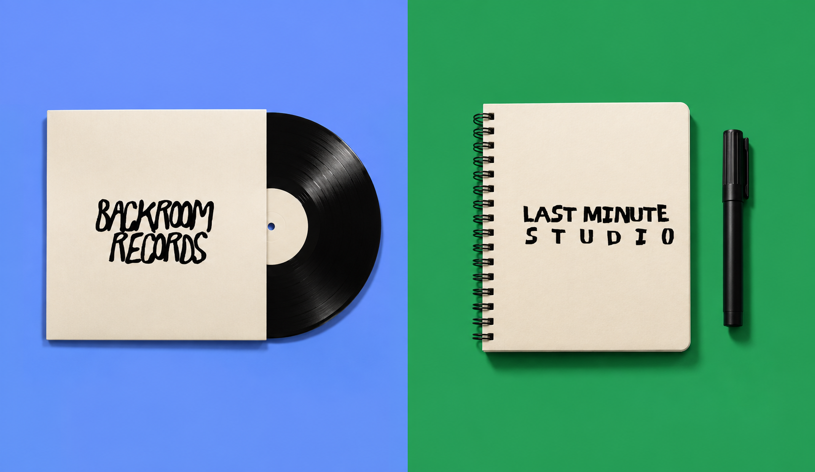
8. Messy handwritten fonts
Best for: zines, artists, music, social graphics, experimental branding
Messy handwritten fonts are useful when polished is exactly what you don’t want.
They can make graphics feel spontaneous, personal and almost like they were scribbled in the margin of a notebook.
Which, visually, is often much more interesting than another immaculate sans serif.
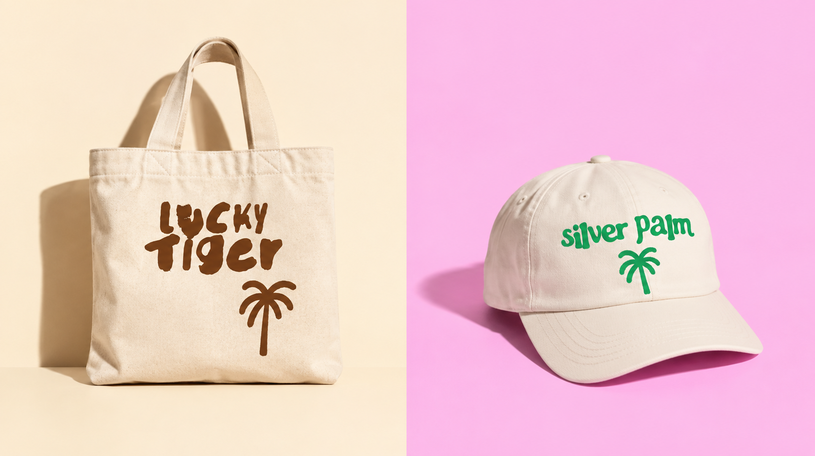
9. Strange logo-style fonts
Best for: branding, logos, fashion, music, creative businesses
Some fonts already look like they want to be logos.
These are great when you need something memorable quickly because the letterforms are distinctive enough to act as a visual identity almost immediately.
They also tend to work really well on packaging, signage, merch and social graphics because they already have a strong visual voice.
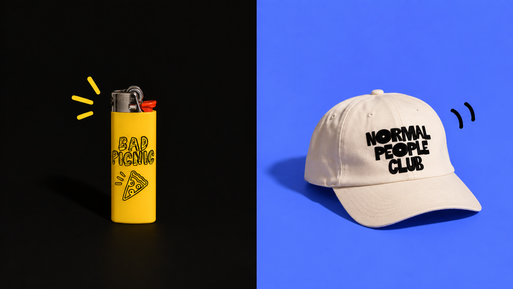
10. Weird fonts that don’t really fit a category
Best for: the fun stuff
Every font library needs a few fonts where the main selling point is basically:
What on earth is that?
These are often the ones that make a project memorable.
They’re useful for experimental design, odd little brands, poster work, art projects and anything that would look worse if you made it more sensible.
A good font library makes everything easier
The more branding work you do, the more obvious it becomes that there isn’t one perfect font style.
Some projects need something neat and restrained. Others need something huge, messy, soft, ugly, weird, retro, handwritten or slightly unhinged.
Having a wider range of type styles makes it much easier to actually match the typography to the personality of the project rather than forcing the same few fonts onto everything.
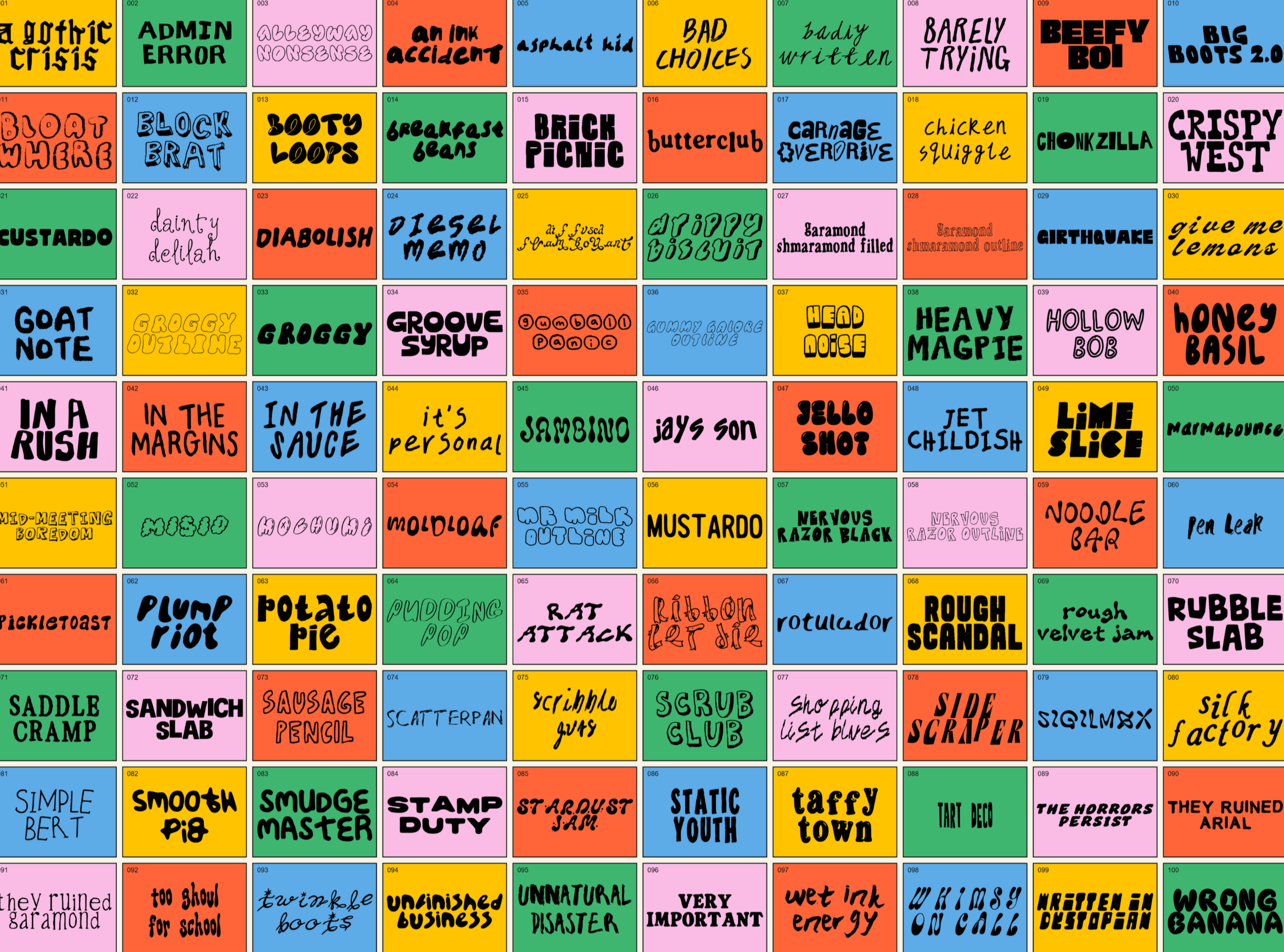
That’s also why I ended up putting together my 100 Fonts Forever Bundle.
It’s the biggest font collection I’ve made so far, with 100 different fonts covering everything from bold display styles and quirky retro type to hand-drawn, messy, playful and handwritten fonts.
It also includes 10 handwritten-style fonts that are exclusive to the bundle and won’t be available separately.
So if you work across branding, packaging, posters, merch, social graphics or generally make a lot of visual stuff, it’s basically a very large box of typographic chaos to dip into whenever a project needs more personality.
You can browse the full 100-font bundle here.
Or, if you’d rather build your collection slowly, you can also browse all individual fonts separately.
Final thought
When you’re choosing fonts for branding, the question usually isn’t:
“Is this font nice?”
It’s:
“Does this font make this brand feel like itself?”
That tiny shift makes choosing type much easier.
And usually much more fun.
The only font bundle you will ever need! Download it here.